

As a task for this brief we have to photograph either a watch, a bag or a whiskey bottle. I have chosen to photograph the whiskey bottle. We have to photograph a pack shot and a creative shot. We have been given a scamp for the creative shot. A scamp is a rough layout of what the Art Director wants the photo to be like. Here is the scamp for the creative shot for the whiskey:

Here is a scamp and and advert for a mobile phone advert:

Here is the creative image for the Deni Deni bag, which could have been photographed for the task:

Here are some more commercial handbag images:


Here is the Christopher Ward watch that could have been photographed for the task:


Here are some examples of commecial whiskey photography:


Rankin did photos of the whiskey being made, with models for Macallan.


Albert Watson did photos of where the whiskey is produced for Macallan.


Here is my finished pack shot:

f16, 1/100 sec, ISO 200, 24mm.


I used flash heads with softbox modifiers on them. I had one above on the boom stand and one below. I tried photographing the bottle with just one of these lights, but it created shadows on the bottle. I feel this image works as a pack shot as it is clean and bright. I used f16 to ensure that all of the bottle is in focus as detail is needed. However, the image is not white all over the background. Maybe another light directly behind was needed or the bottom light to be higher. The label is also wonky and part peeling off.
Here is a contact sheet from my first creative shot:

I used a flash head with a an umbrella on it for these photos. This created lots of light, but sometime took out the fire.
Here is the best image:

f4.8, 8.0 sec, ISO 100, 32mm.
The bottle and the glasses adhere to the scamp in this image. However, the image is taken from the wrong angle with a too bright background. I used f4.8 to create a shallow depth of field to make the bottle in focus and the fire out of focus as required.
Here is the contact sheet for my second creative shoot:

Here is my best image:

f5.6, 5.0 sec, ISO 100, 36mm.
To light this image I used a flash head on model light and held it over the bottle to light just the bottle and not so much the background. I darkened the background in Lightroom. I feel that this has almost made it too dark, the glasses are not positioned as on the scamp and I think the overall image has been slightly over edited. However, I do feel that it is an improvement of my first attempt.
As a group we gave feedback to eachother on our images. Here are my feedback marks from my fellow students:
85% warm welcoming
70% glasses well lit and bottle
70% nice positioning, nice light, label clear, don't like glass
80% has a sepia tone to it good/bad? Scamps correct, nice fire, well lit, too much whiskey in glasses. Shadow on bottle is bad.
70% label is yellow when supposed to be white.
50%
80%
75%
75% glasses in wrong place
60% bottle not lit correctly, glasses look slightly cloudy. Background too dark. Look over edited on bottle.
60% glasses too full. Colour is distracting.
70% bottle lit lovely as well as glass. Over exposed and whiskey looks a weird colour.
60% nice focus a little dark, bottle looks great.
60% adheres to scamp, excellent focus, shallow depth of field. Minor inappropriate reflections on glass, glasses positioned incorrectly.
80% well lit bottle and fire.
My actual mark from the staff was 55%.
Here are some lens adverts:

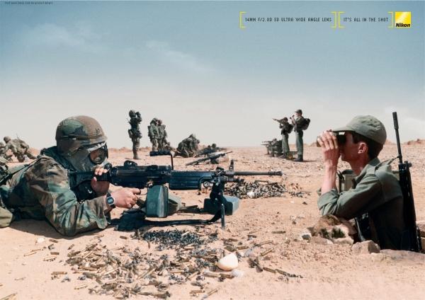

I noticed that these adverts were selling lenses, but they didn't actually have the product in the image.
Here is a Nikon lens advert using a wildlife photo:

I have chosen to use this advert from the Nikkor lens brochure as my commercial image.

The photo in this image is by Tim McKenna.
Here are some more lens brochures:
Here is the image a used for the advert:

f5.6, 1/40 sec, ISO 100 and 220mm.
This image was taken at Martin Mere Wildfowl Reserve. I feel that it captures the motion needed for the advert. However, maybe the image isn't sharp enough, to advertise the vibration reduction.
Here is the contact sheet for my first pack shot of the lens:

I photograph all the different parts of the lens.

f22, 0.6 sec, ISO 100 and 45mm

I first took the images with the lens upright. I used continuous lighting with a soft box at each side of the lens. I used f22 in order to get the detail in the lens and have the whole image sharp. I think this image works as a commercial image of the lens. It is clean and bright, there is detail in the lens and the writing on the lens is clear.
However, in the original Nikkor advert and throughout their brochure, the images of the lens are positioned vertically. I then photographed the lens again with it vertically.

Here is my final image:

I used f22, 0.6 sec, ISO 100 and 55mm focal length. I used a folded lens cloth behind the lens to stop it from rolling back. I added the otter image and the lens image to the Nikkor lens brochure page, so that it adhered to the corporate identity and fit in well with the feel of the brochure.


I used the move tool to be able to select the photo.

I used the eyedropper tool to select the colour background. This will make sure that the colour that is selected is exactly the same as the background. I clicked on the eyedropper tool and then clicked on the background.

The selected colour is now the same as the background.

I then used the zoom and then zoom in buttons to zoom into the lens part of the image.

I then used the paintbrush tool with the selected colour to paint over the lens.

The image then looked like this.

I then moved the otter picture onto the advert. I did this by clicking on the photo and dragging it accross to the advert.

I then resized the image so if fit where the other photo was.

I zoomed in and painted over the copyright and photographer name.

The image then looked like this.

I then moved accross and I had to change the text as the lens was different. I needed to write what the lens I used was. I clicked on the text button and I used the nearest similar font and font size. I then drew a box and typed in the lens details.

The image then looked like this.

I clicked on the move tool and aligned the two texts at the end. I then clicked on the eye of the text layer to make it not visible.

I then painted over the text that I didn't need.

The image then looked like this.

The image then looked like this.

I then zoomed out to see the image.

I then had to put the lens photo onto the advert. I needed to seperate the lens from the background. To do this I used the magnetic lasso tool and drew around the lens.

The dashed lines then appeared around the lens.

I then clicked on the move tool to move the image.

It then created a box around the lens.

I could then move the lens and seperate the lens form the background.

I moved the lens onto the advert. It then needed resizing.

I moved the lens so that I could click and drag the corner to resize it.

This is the finished image.

However, I realised that the original advert had the lens horizontally. I reshot the lens and I cut around it like before.

The dashed lines then appeared.

I then clicked on the advert, clicked on the layer with the lens on, pressed delete and clicked yes.

I then moved the image of the horizontal lens accross to the advert. I resized the lens. I right clicked on it and clicked on bring to front, so all of the lens was in view.

Here is the final finished image.

The
commercial brief allows us to link the work we produce to our chosen field. As
my chosen field within photography is wildlife, I decided to do an advert with
a wildlife photo in it. After some research, I realised that lens adverts used
wildlife images in their adverts, so I decided to use those. I decided to use
Nikkor’s brochure page for the telephoto lens. I went to Martin Mere Wildfowl
Reserve with the view to photograph motion, as the tagline for the telephoto
lens is “Nail the decisive moment and capture the motion from a distance”. I
used f5.6, 1/40 sec, ISO 100 and 220mm focal length to capture the image of the
running otter. I feel this image goes with the tagline and therefore works in
the final image. However, the image could have been maybe a little sharper to
go with the text about vibration reduction. Maybe if the image was taken on a
quicker shutter speed it may have been better. I then took photos of my Nikkor
55-300mm lens. I first took the images with the lens upright. I used continuous
lighting with a soft box at each side of the lens. I used f22, 0.6 sec, ISO 100
and 45mm focal length. I used f22 in order to get the detail in the lens and
have the whole image sharp. I think this image works as a commercial image of
the lens. It is clean and bright, there is detail in the lens and the writing
on the lens is clear. However, in the original Nikkor advert and throughout
their brochure, the images of the lens are positioned vertically. I then
photographed the lens again with it vertically. I used f22, 0.6 sec, ISO 100
and 55mm focal length. I used a folded lens cloth behind the lens to stop it
from rolling back. I added the otter image and the lens image to the Nikkor
lens brochure page, so that it adhered to the corporate identity and fit in well
with the feel of the brochure.
The
overall advert adhered to the Nikkor brochure layout and look. The images fit
well in the page and look like they could fit well in the Nikkor lens brochure.
However, the image of the otter could be sharper. Also, the image of the lens
is at the wrong angle from the original brochure page. The image of the lens
that I have taken is straight on whereas, on the brochure page you can see the
glass of the front of the lens. This would need to be amended to make the image
more like the original. Also, the font of the lens name isn’t exactly the same.
This would also need changing.